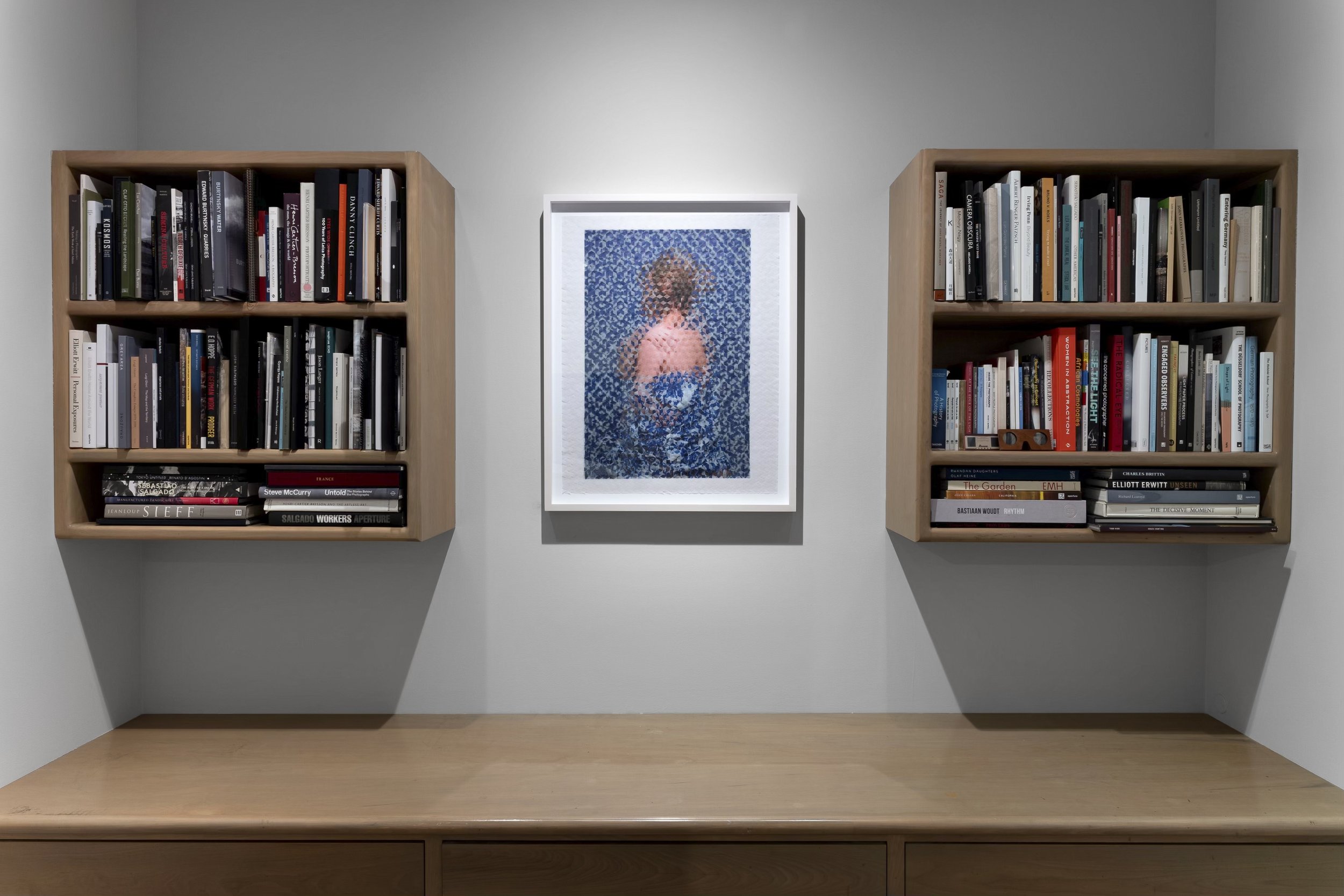
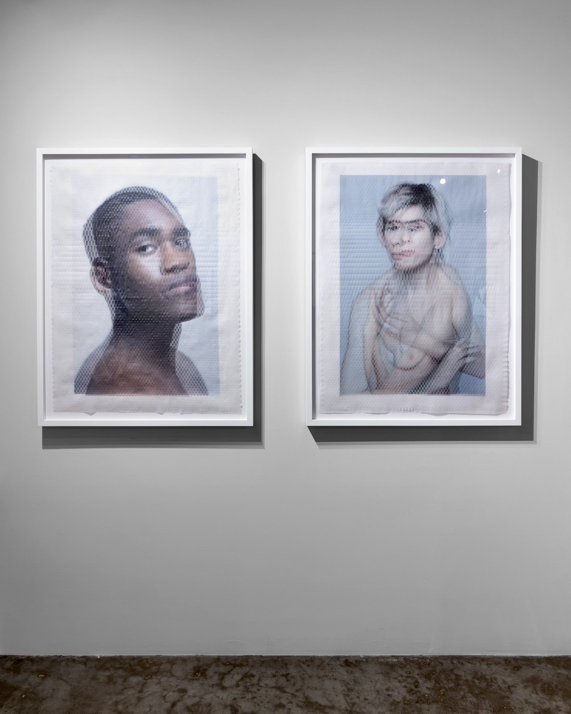
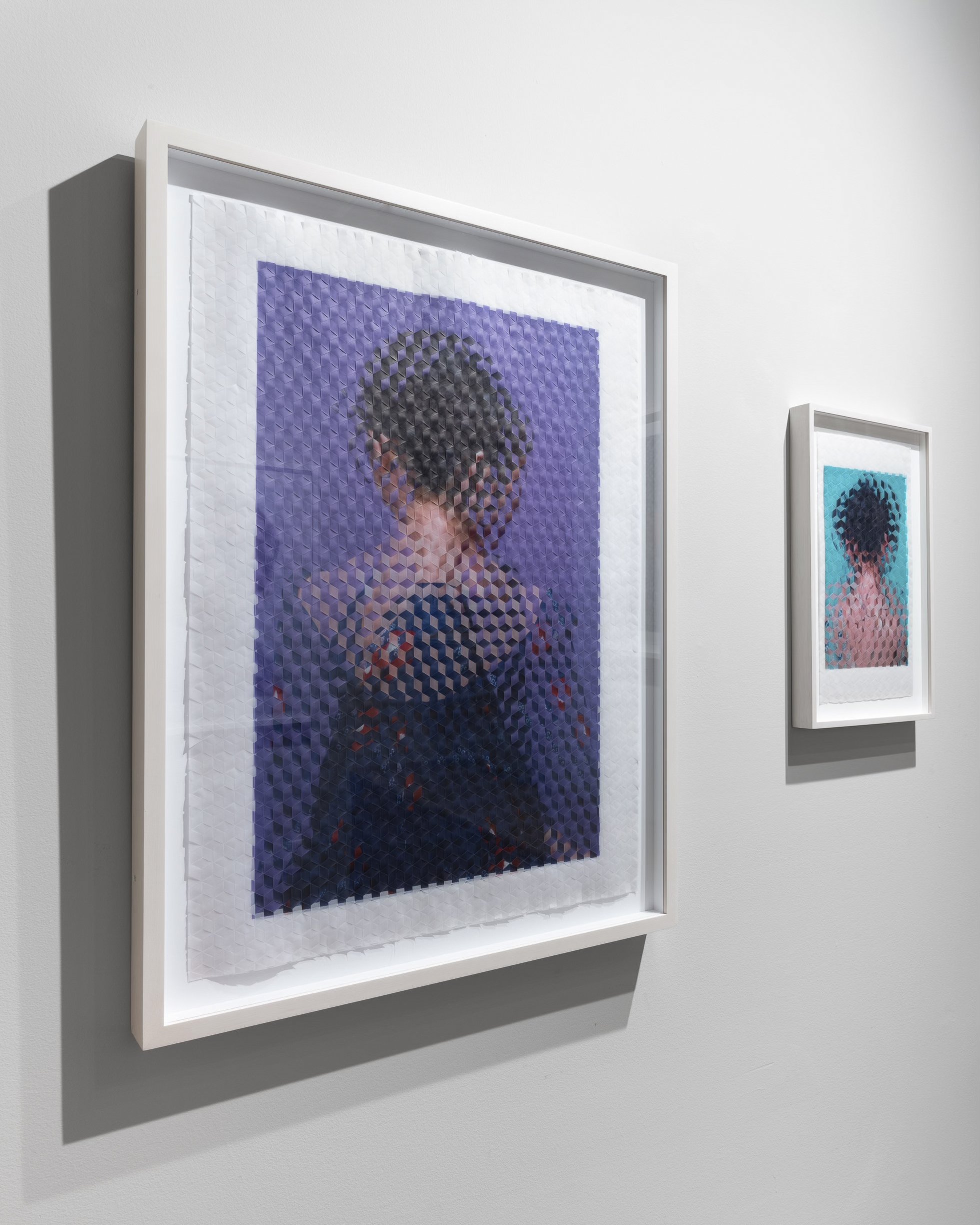
I’m pleased to report that the May 26 issue of The New Yorker (and online here) features a Woven Portrait, commissioned by the magazine, to accompany Michael Pollan’s article “High Priests: What religious leaders learned from taking magic mushrooms” (also goes by the title “This Is Your Priest on Drugs”).
In early March, Art Director Supriya Kalidas contacted me about the project and sent me an early draft of Pollan's article, which outlines a study in which psilocybin was administered to various religious leaders, noting their experiences as well as the lasting changes several of those leaders encountered on a more personal front. I was struck how several of the subjects recounted experiencing the divine on an intimate, even sensual, level, and how “a majority of the participants...understood God as a distinctly feminine presence.”
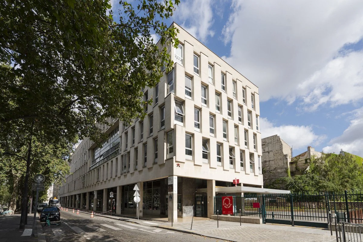
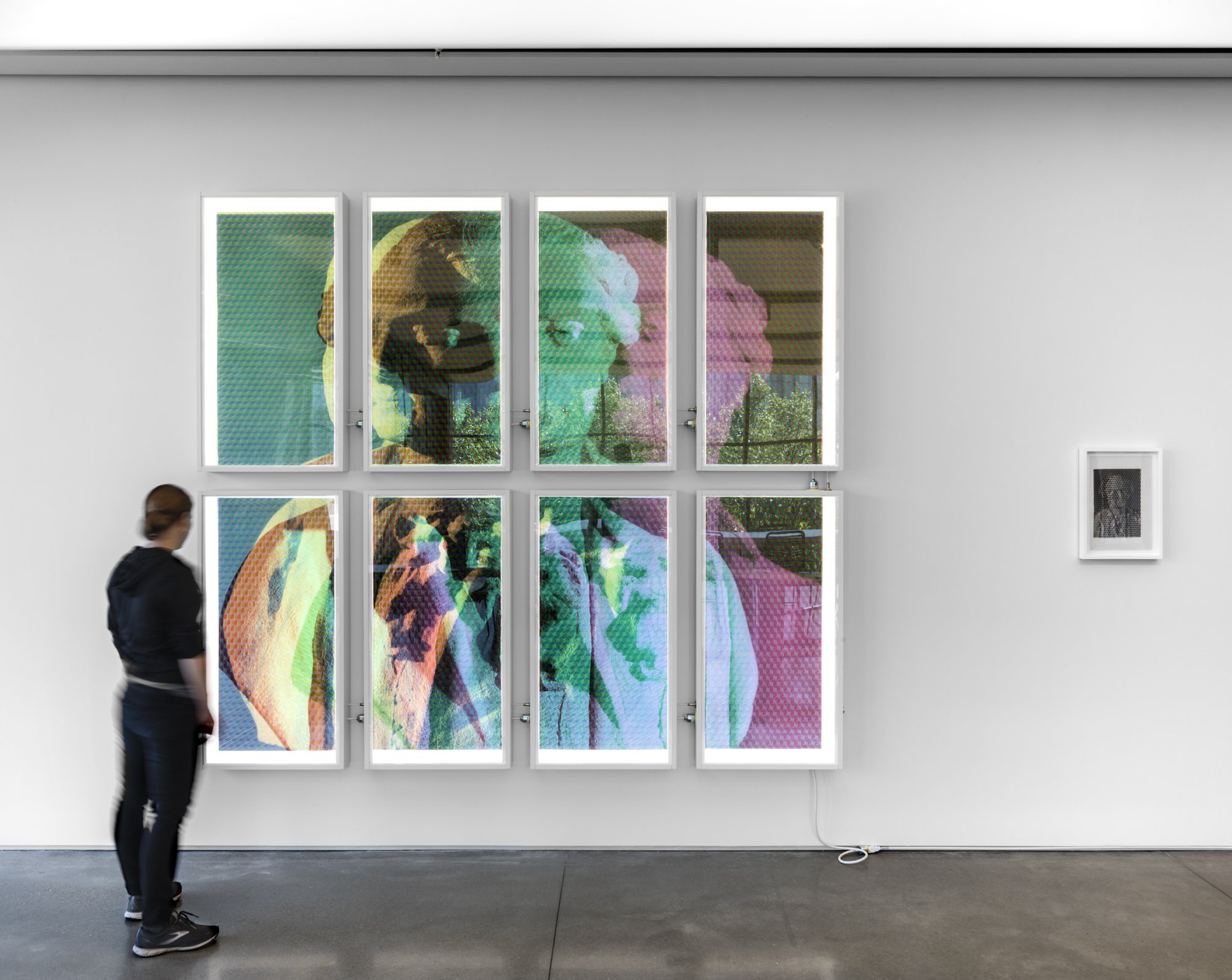
I received this commission during my term as artist-in-residence at Cité internationale des arts in Paris, so I didn’t have access to my full-time studio in New York, nor my normal assortment of tools and equipment, that I would ordinarily use to make a Woven Portrait. Discussing this issue and the article and general with Supriya, I suggested photographing the statue of Mary Magdalene that serves as part of the dramatic altarpiece of L'église de la Madeleine in Paris. (The array of statues that make up the altarpiece is collectively titled “The Ecstasy of Mary Magdalene”, completed by Carlo Marochetti in 1841.) To me the statue seems to depict a deeply spiritual experience—one that is not necessarily specifically Christian in nature. As an iconic yet relatable female saint, Mary Magdalene also seemed a very appropriate subject.
(Additionally, before visiting the church myself, I could see from photos available online that the lighting of the statue was very good. So an attempt to make formal arrangements with the church to have a shoot with equipment and special access grants wouldn't be needed.)
While in Paris I had also given a lot of thought to Joan of Arc (Jeanne d'Arc), a patron saint of France, and the subject of a photoshoot I arranged and executed in January at Petit Palais, which will eventually result in a large Woven Portrait of Her. Although I'm not a religious person, I find the female saints to be especially moving, and I appreciate the sincerity of their aura. Medieval thinkers, architects, and artists shaped Paris in a way that makes sense to this part of my mind, and perhaps it reflects something about my personality. In any case, this also contributed to my thinking regarding choosing a subject to photograph for this commission.
So in mid March I took the métro to La Madeleine and by chance arrived at the perfect moment: a church staffer was removing the chairs in front of the sanctuary to accommodate a concert that would be setting up a little later in the afternoon; I was able to move around and photograph the Marochetti's Mary Magdalene from various angles unencumbered. I took about 30 frames and then sat in the large Neoclassical church as the concert set up. I thought about Marie-Madeleine and Jeanne d’Arc, and about the comparative inanity and ego of calling something art. I lit a votive candle before a small statue of Jeanne, and I thanked Her for what She did. To me, the truth of Her story is independent of whatever its actual facts might have been. I wasn’t in the mood to listen to the concert (a high-school wind band from Minnesota touring France), so, as they went through their warm-ups, I exited La Madeleine back into the absurdly fashionable 8ème arrondissement.
I made about ten mockups, one of which, after some discussion, was given the go-ahead. Since I didn't have access to my studio printer nor to the vellum I ordinarily use when I’m in New York, I outsourced the printing of three of the photos I took to a lab in Paris. I asked the lab to print on translucent polyester film (that they described as “opalescent”), one of the media they offered as an alternative to photo paper or watercolor paper, etc. The polyester prints were thicker than vellum so the cuts ran a bit rougher than those made within my usual process. I cut the three prints into 12mm-wide strips, as layout models I had made indicated that they would scale down to the print size rather well after being photographed upon completion of the physical artwork.
The physical artwork was hardly translucent. The polyester’s thickness played a role in this. Also, the medium simply wasn't as translucent as vellum. And when three prints were woven together, the result was an almost completely opaque physical composite. Luckily a powerful strobe head with me in Paris. So, rather than using a lightbox to backlight the physical woven artwork in order to photograph it for publication, I positioned the strobe directly behind the artwork, pointing directly at the camera lens. By way of this extreme form of backlighting, I managed to get enough light to pass through the physical artwork that the piece appears almost normally backlit.
Yet due to the unique characteristics of the polyester film—its thickness and only slight translucency—this Woven Portrait of Mary Magdalene appears a bit hasher than usual, with more emphasis on the strips' edges and their triaxial intersections. The piece misses much of what I'd planned for in the mockups, in terms of precisely how the three photos of the subject would line up (again due to the unexpected thickness of the polyester film), and in terms of the contrast of the composite image (almost none of La Madeleine's ornate interior is visible behind the statue. But I’m glad that, to me anyway, the image comes across as a generally spiritual subject (though on some level it is overtly a Christian one) set against a night sky or within a stained-glass window. And I’m glad I got to spend this time with Marie-Madeleine of Paris, and make something work for the publication.
